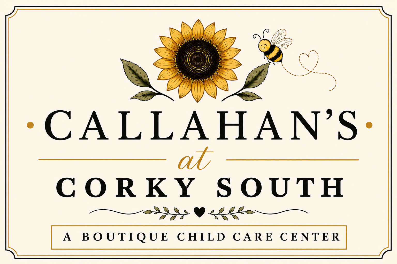
We chose every piece of our logo on purpose, and we want families to know the story behind it.
The name Callahan’s at Corky South honors “Mac Callahan”, a child at one of our sister campuses. Mac was born with Down syndrome. He was our first child with Down syndrome at any Corky location, and he changed the way we think about welcoming every child, individual learning, and celebrating each child exactly as they are. Our school carries his name, and it also stands for every child who reminds us that something wonderful can grow from being different.
A sunflower sits at the center of our logo, and it carries two meanings. It honors a woman who spent over 40 years caring for young children before she retired, Jessyca’s Aunt Sonya. It also carries a lesson we love: sunflowers turn toward the light, and when the sun is hidden, they turn toward each other instead. We want Corky South to feel the same way: a place where children, families, and teachers lean on one another through every season.
A small honeybee sits near the sunflower. Bees are tiny, but they hold up entire gardens and food systems. We believe every child holds that same kind of value, no matter their size, age, or ability. The bee also stands for hard work, purpose, and working together.
Look closely at the bee’s path and you will find a small heart tucked inside it. We placed that heart there on purpose. We believe everything we do starts with love, and children grow best when they feel known and safe first.
Soft greenery fills out the design. It stands for growth and new beginnings, and it reflects our commitment to keeping children connected to nature through daily outdoor learning time and natural materials.
We chose our colors with care, too. Warm yellow honors our Regional Director, Mrs Brenda,whose favorite color is yellow and whose spirit has shaped our culture. Soft green reflects growth and nature. Warm cream and ivory give the brand a timeless, welcoming feel. Black type keeps everything clean and grounded.
We made every choice on purpose. We wanted the logo to feel like a picture of who we are.